Synergy Foods Packaging design
- Branding
- Design
- Ideation
- Merchandise
Designing packaging for Synergy Foods' tasty treats to stand out on the shelf
CHALLENGE
Synergy Foods asked us to design branding for two different food packaging styles within very different markets. We needed to ensure each design would really stand out in their relevant retail environments.
With two different demographics and tastes in mind, the packaging design needed to be adaptable to suit the different flavour options of each product.
SOLUTION
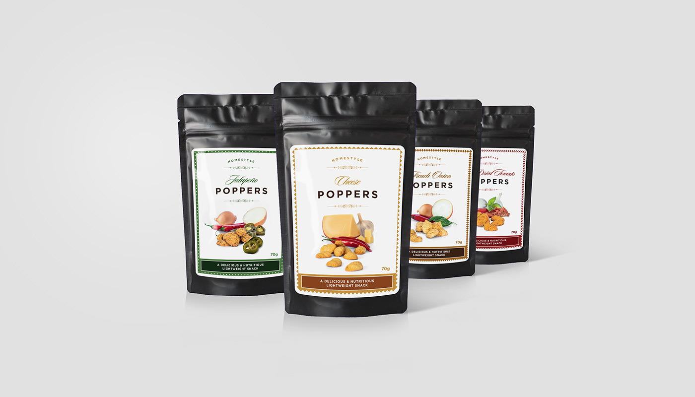
For the savoury snack, use of white and scripted font appeals to an older, more discerning audience. The sweet treat uses bold pops of colour and graphics to appeal to a wider, younger demographic.
The design needed to work well for each individual package and colour, but above all, they need to look attractive side-by-side. Just like they will on the supermarket shelf!
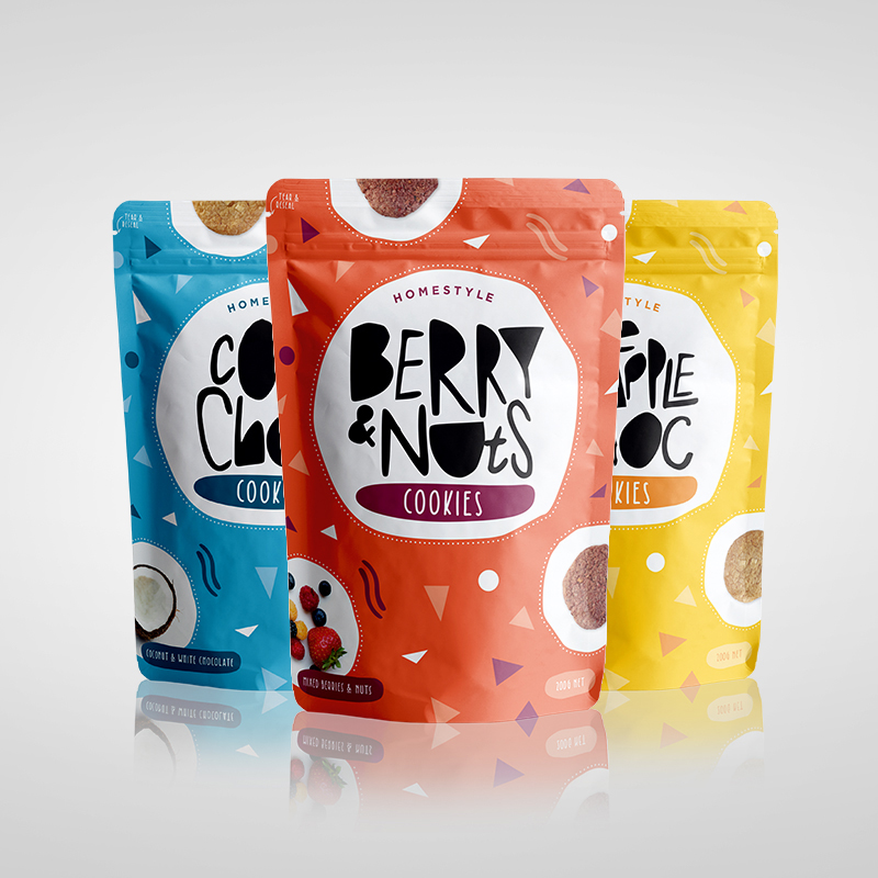
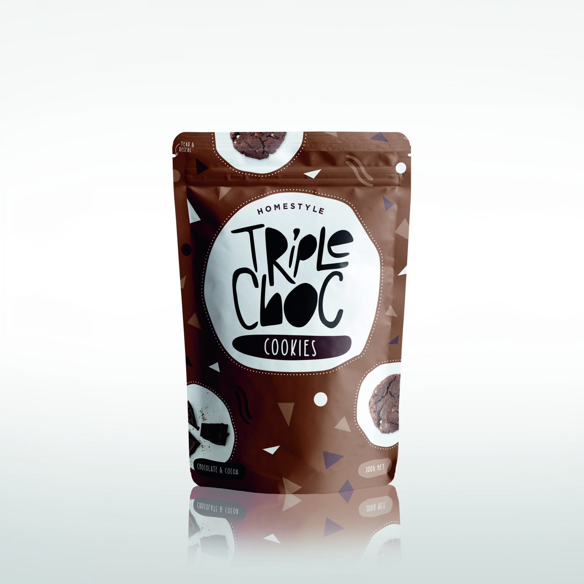
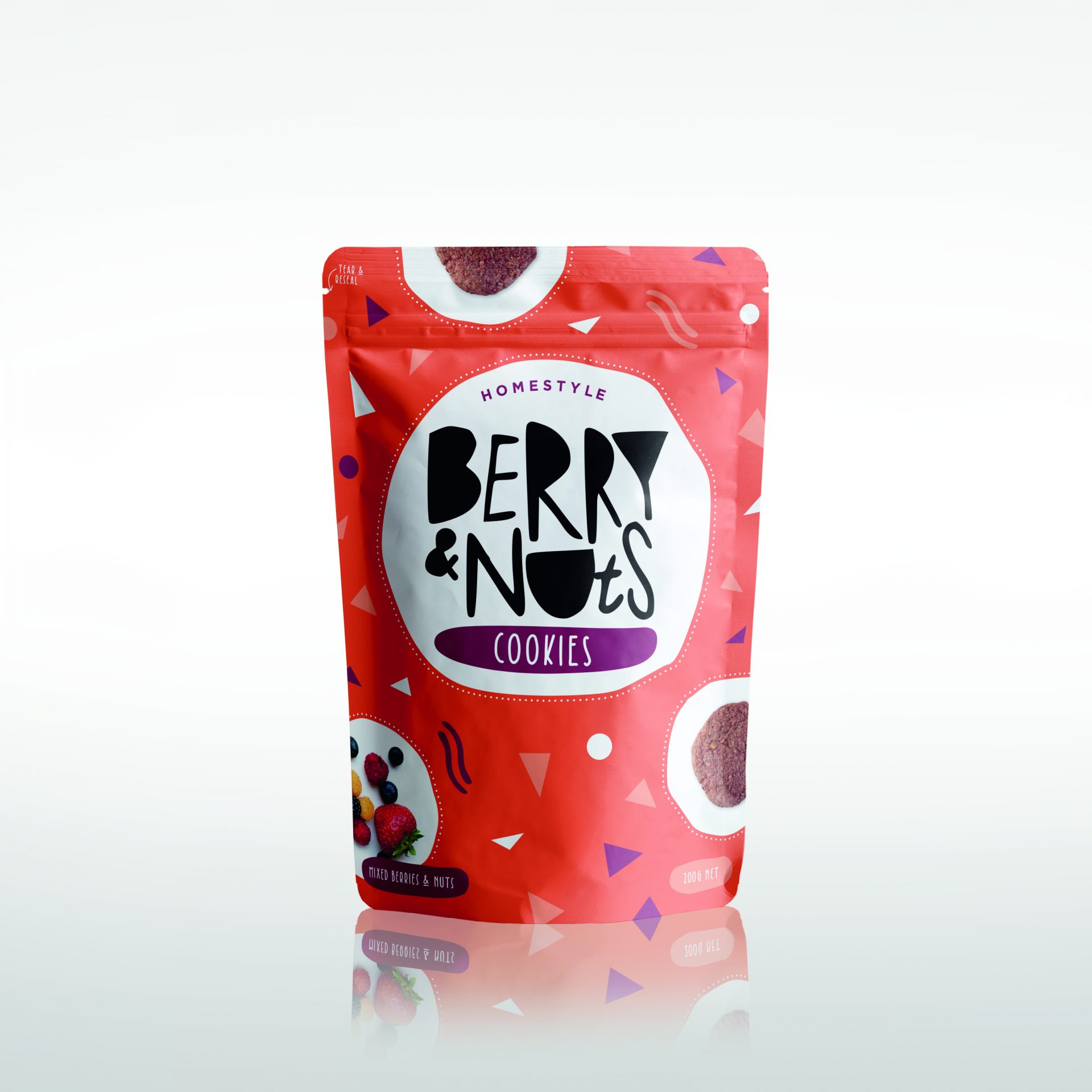
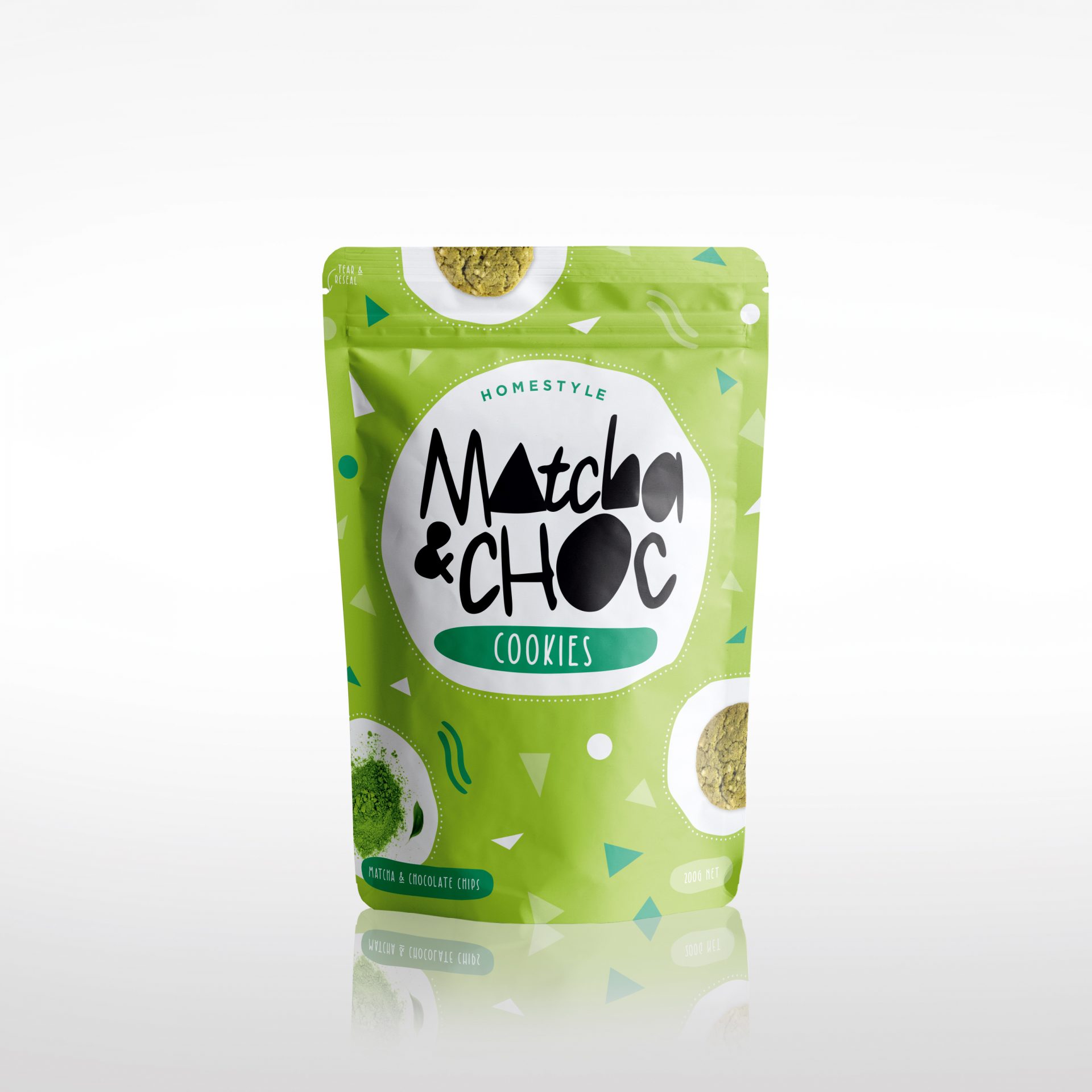
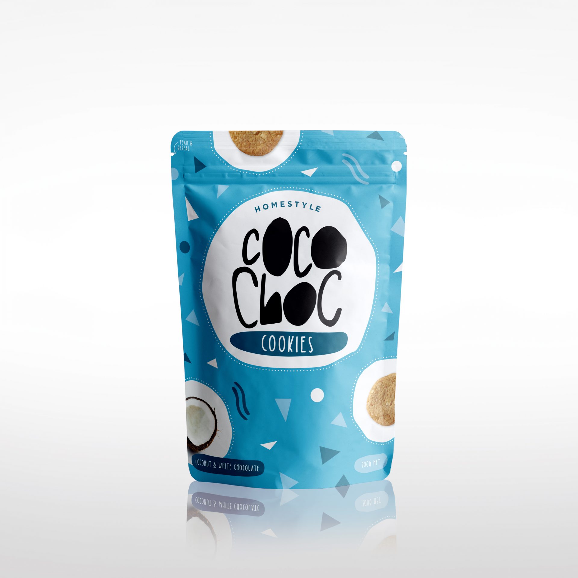
COOKIE PACKAGING
A sweet snack for a wider, younger audience. Perfectly pairs well with a cup of tea or hot chocolate!
The brief was to create a more fun and playful packaging design without feeling childish.
The solution: vibrant colours paired with bold and fun typography, to achieve a homestyle/crafty feel.
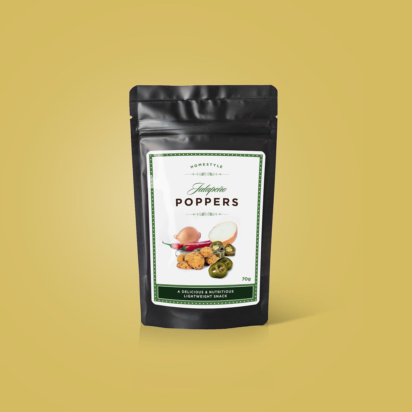
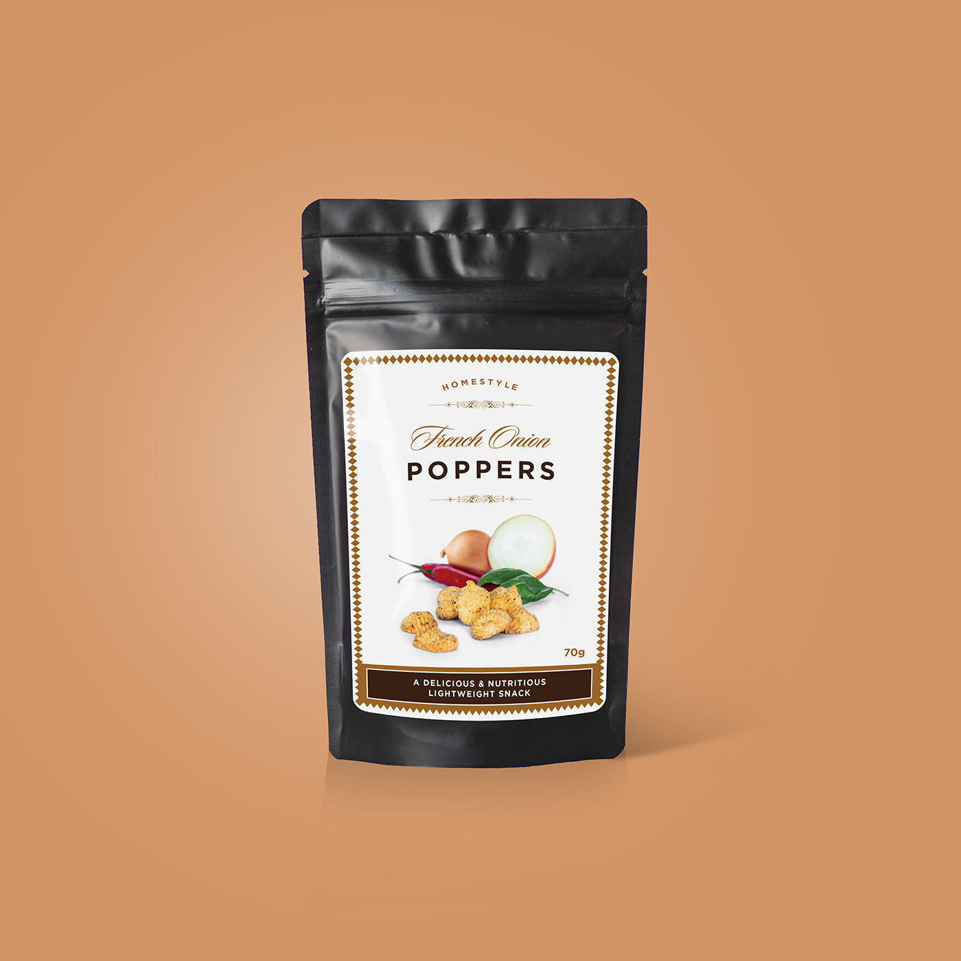
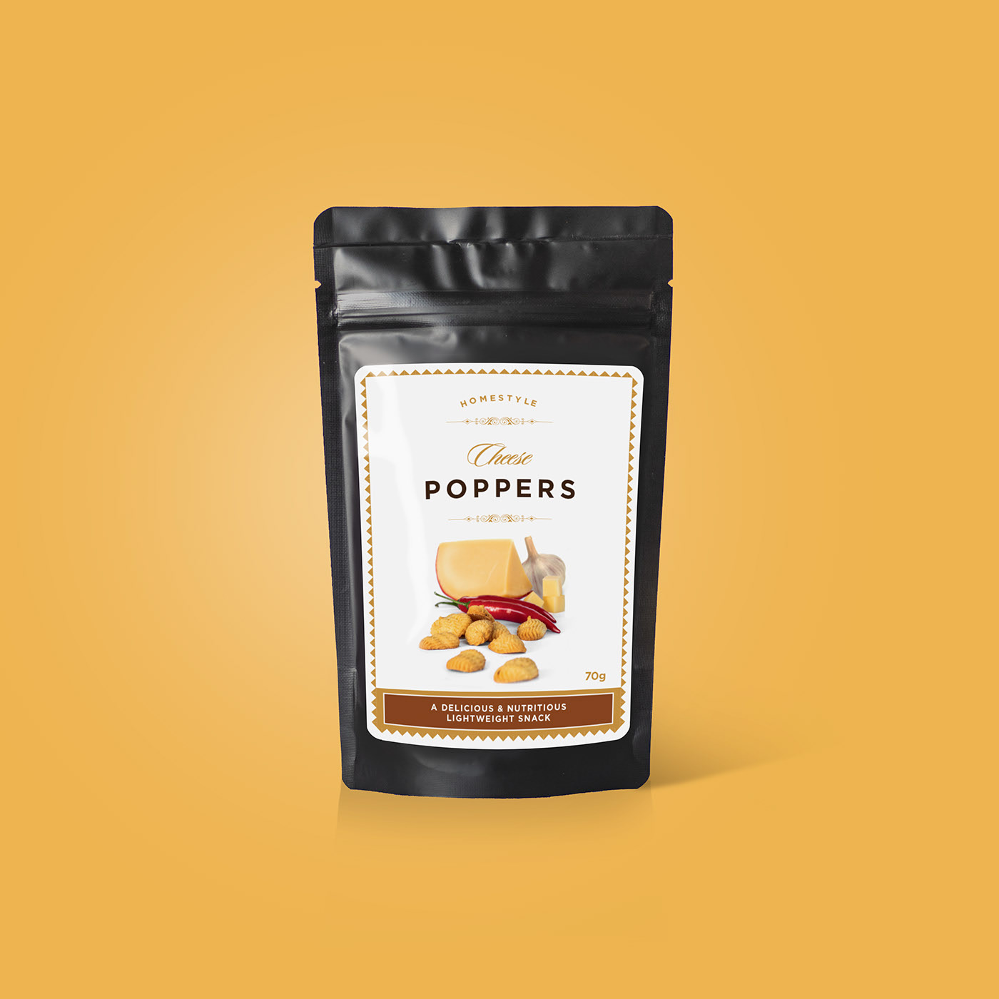
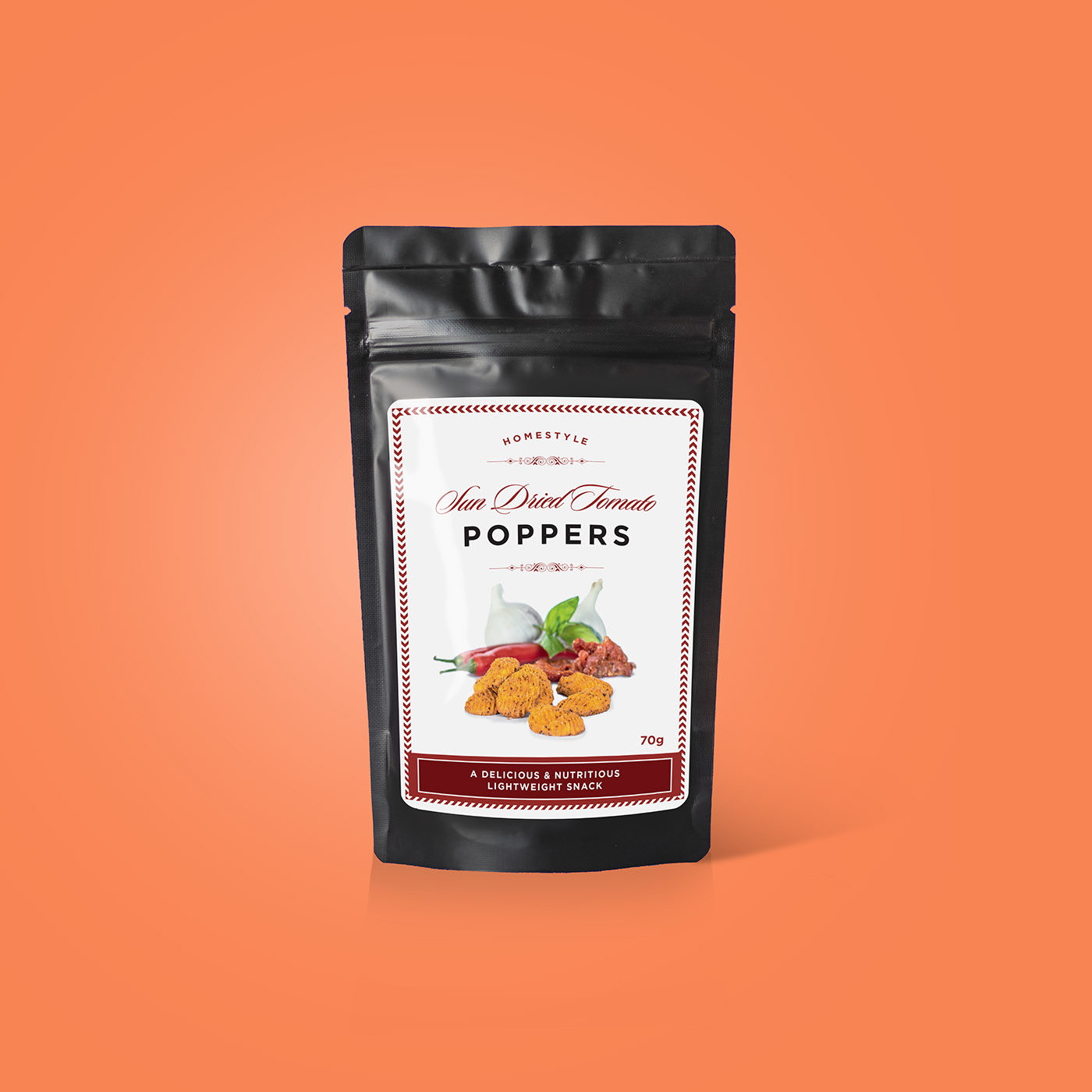
SAVOURY POPPERS
A savory treat for a discerning, older consumer. These go well on a cheese board or with a glass of wine!
The brief was to create attractive, elegant packaging that communicates high quality.
The solution: high-quality imagery paired with chic and clean typography.
Off Grid Electrical

Penny Homes