
CLIENT
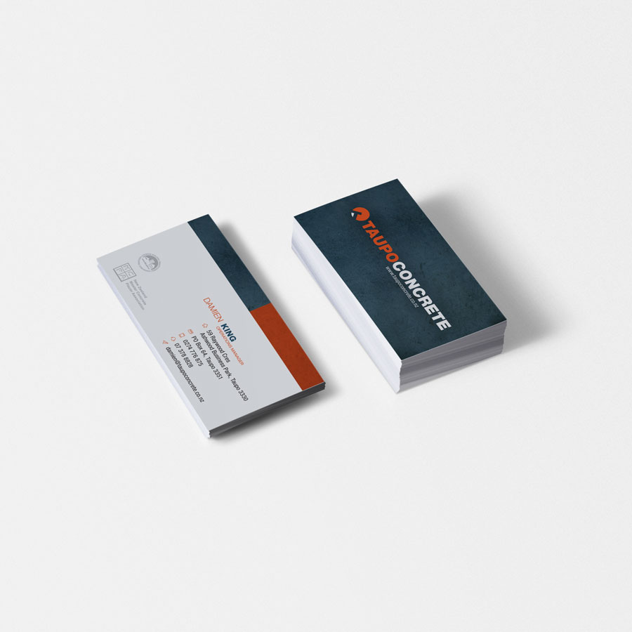
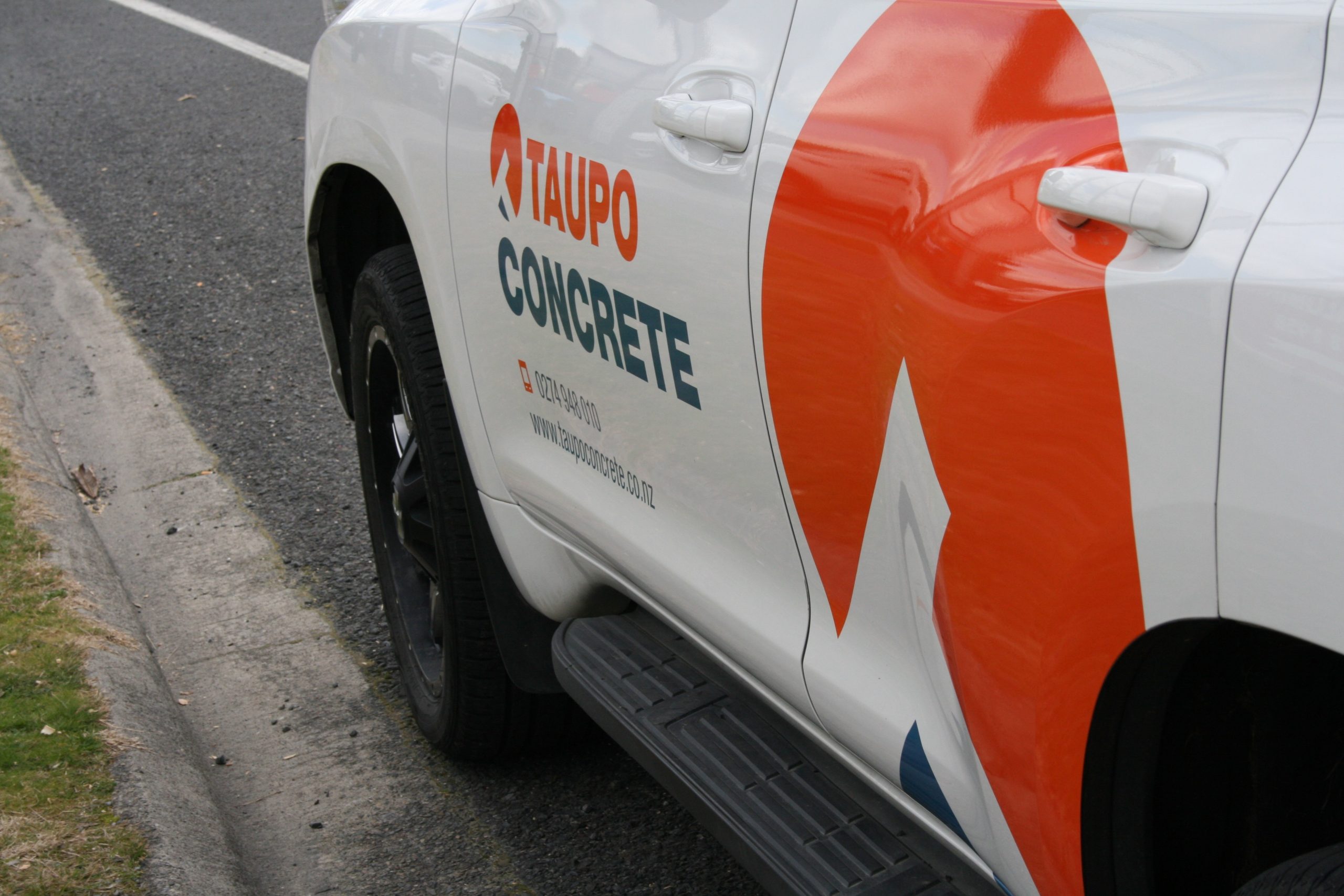
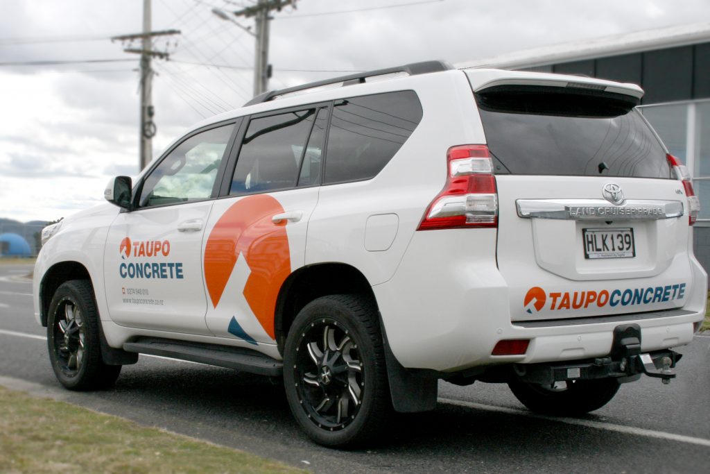
Modern, clean and strong were the keywords in the brief for Taupo Concrete’s brand refresh.
The business has been looking after the Taupo region’s concrete placing and finishing needs since 1997, and was in need of an updated brand to be rolled out both online and offline.
SOLUTION
As part of the branding package selected by Taupo Concrete, we designed a new logo with logo mark to define the new era of the business.
This new mark is able to be used across a wide range of placements, like the new website, business cards, company vehicles, letterheads and email signatures.
BRAND REFRESH
Starting with the new set of brand guidelines, ninetyblack not only updated their font and brand colour palette but came up with an entirely new story-telling logo mark.
This has become a matching addition to the brand.